
The first thing I wanted to change about the landing page was the fact that it didn't cover the entire screen. The page had been set to a fixed width, leaving a lot of white space around it. To increase the appeal of the site, I wanted the landing page to incorporate a high impact full screen image.
I also wanted to change the fact that the full image of the artwork wasn't displayed. The landing page didn't have enough room to display the full images, but the cropped images didn't appeal to the user as much because the user wouldn't be able to gain a complete sense of the painting or the artist's style.

I like that the artist page focuses on the work of the artist, rather than just the artist himself. I also like that users will be able to navigate to other artists easily. However, the biggest thing to change would be how the material is presented. I would want the artist biography to be on one page, so the user wouldn't have to scroll to read. If the biography looks too long, the user might not be as inclined to read through all of it. I also want to create a separate page that is dedicated to just the artists, rather than combining it with the gallery so that the users are able to clearly decide whether they want to look at art or first learn about the artists and then look at the art.
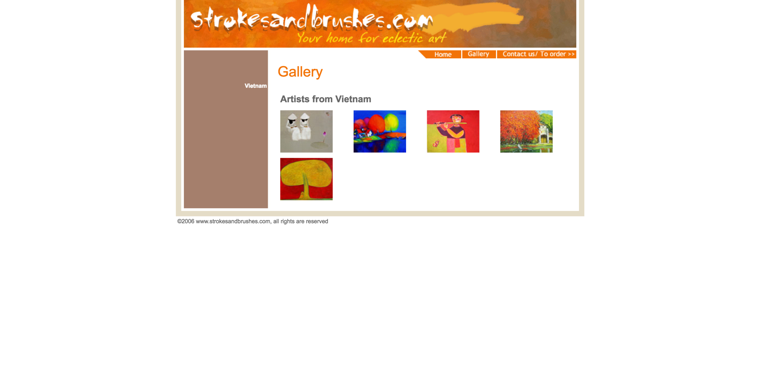
I liked that the gallery page displayed the full images, but I thought the name was a little misleading. As a user, I would go to the gallery page to view all the artworks available, but this gallery page only has one artwork per artist.
I think that an Artists from Vietnam page is necessary, but that should be a separate page that the user would go to if he wanted to learn more about each artist. In my redesign, the gallery page will be completely focused on the artwork, allowing the user to view each one in detail without any distractions.

The contact page seemed relatively straightforward, the only thing that I wanted to get rid of was the "Vietnam" on the sidebar. It didn't serve any purpose and it looks out of place. Other than that, this seemed to be fine.