
overview:
Transportation is rapidly changing and the landscape of urban transport is becoming increasingly influenced by micro-mobility. Movement patterns are fascinating and useful for various reasons, especially to inform urban planning, infrastructure, and technology developments in order to create the most seamless transportation experience for people.
This project is an exploration into New York City’s bikesharing patterns to understand the way the city moves.
Research:
I centered my research around the following primary research questions:

why:
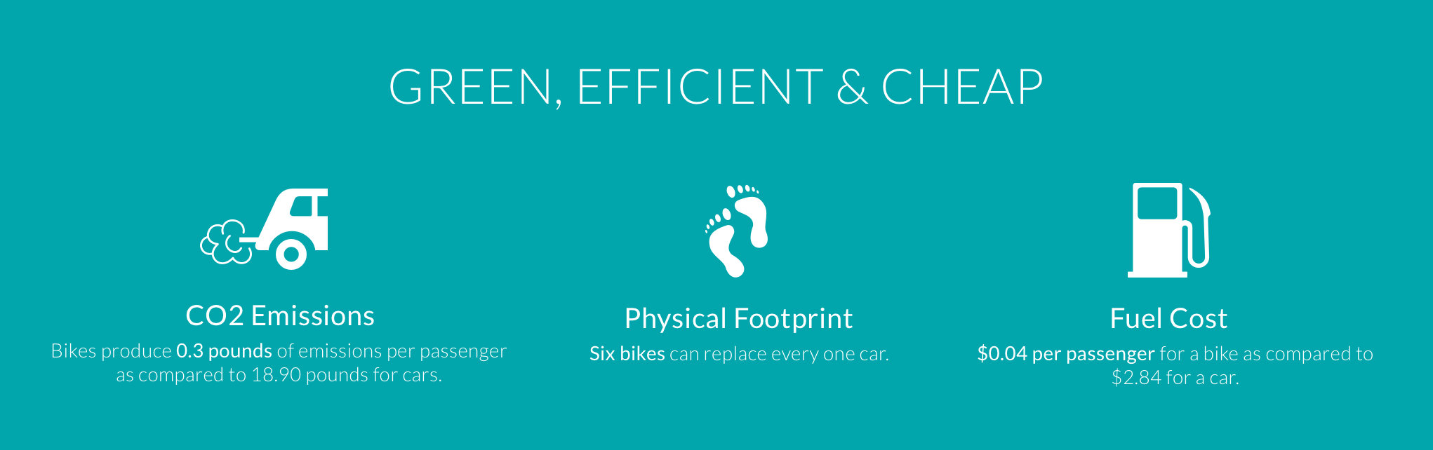
Micro Mobility is part of the solution. The future of our cities depend on efficient transportation systems that contribute to a powerful mobility ecosystem . Public transit systems should be redesigned to better integrate and leverage emerging micro mobility platforms.
FINDINGS:
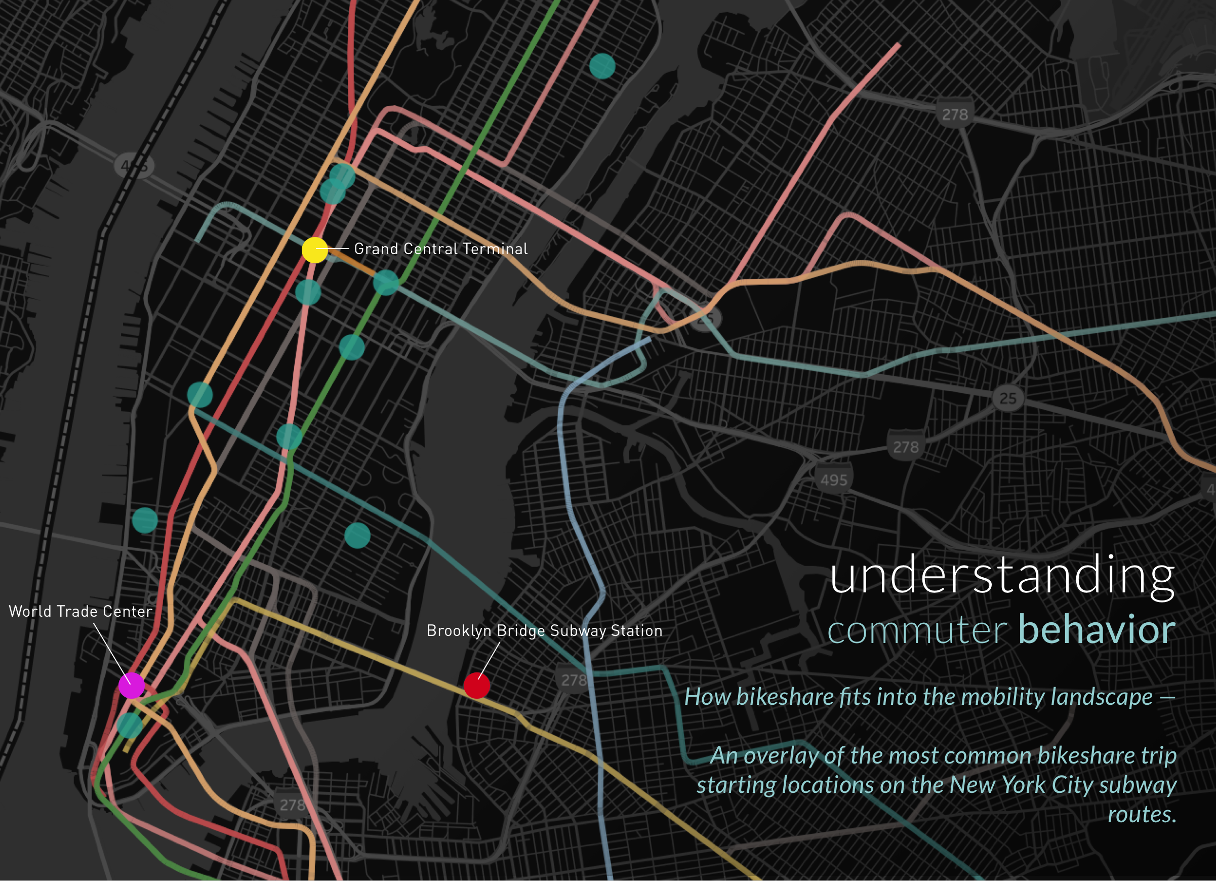
The final output below shows New York City’s movement over the course of one 24 hour period. This visualization shows the pulse of New York’s commuting patterns and the heartbeat of the Citi Bike network over the course of a day.
In the visualization below, green markers represent a greater number of departures and red markers represent a greater number of arrivals for each station.

The following are supporting visualizations to show the impact of a solution that targets the “last mile” issue to provide commuters with greater accessibility to mass transit systems.

learnings:
Citi Bike systems are a gateway into the next transportation revolution, empowering areas in which mass transit lapses.
Data must be thoughtfully transformed given contextual setting to provide the most intuitive understanding.
The goal and hypothesis of a visualization must be clearly set at the beginning of research to provide an anchor point for further research.