
Venn is a social network rooted in the actualization of inter- and intra-group interactions. This product looks to capture the important constructs of sharing media within and between groups of people.
This is a start-up product that involves user flow, visual design, mockups, and interaction design.
Venn Team:
Faris Sbahi, Thomas Wang, Neil Wu, Ashka Stephen, Chentian Jiang, Vivian Wang
View our product website here and the beta test version on the App Store here!
Problem: When people interact in groups, technology often replaces human interaction.
Solution: Venn focuses on using technology to enhance, rather than replace, human interaction by providing technology as a medium of connecting in real life in group settings.
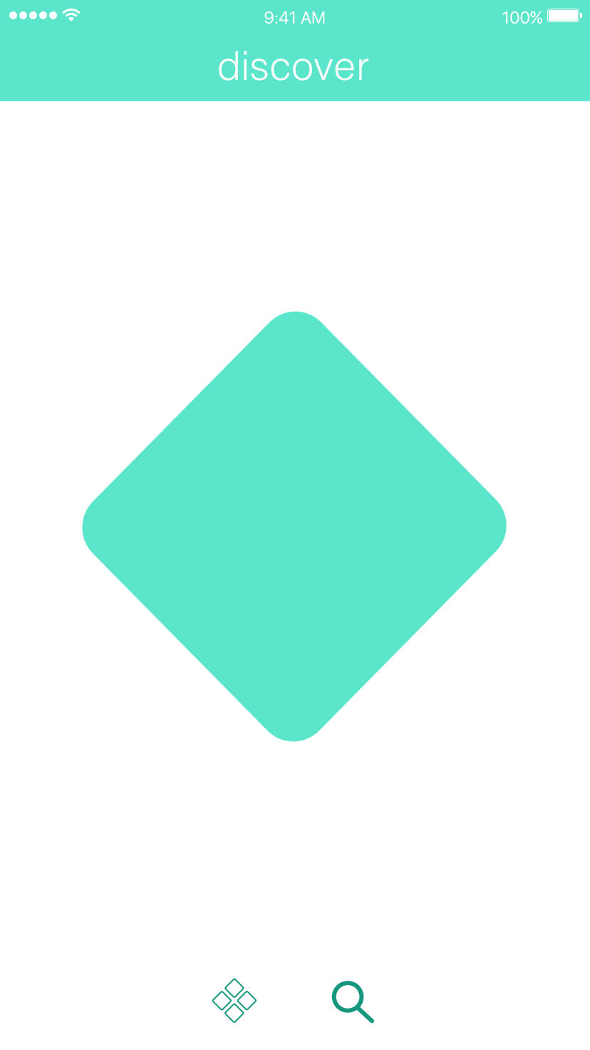
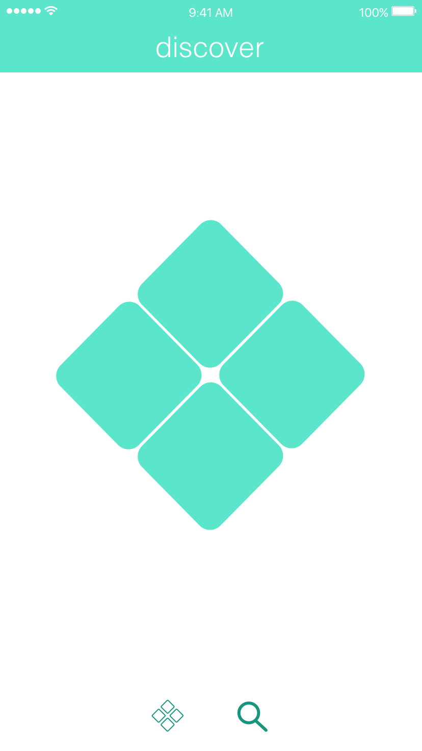
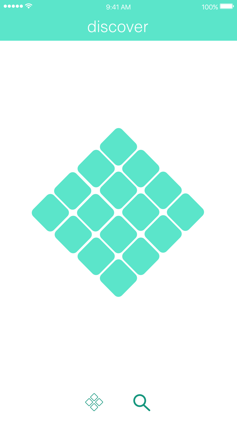
LOGO DESIGN:
The first task was to design a logo for the product. The goal was clear: design a simplistic, aesthetic, and recognizable logo that carries the theme of the product.
The process is shown below, from inception to completion:


USER PERSONAS:
When creating the product, there were three main features that our team wanted to focus on: creating mixers, venn interactive groups, and discover feeds. To simplify this process and to be able to understand the direction in which to present the product, I came up with two user personas:
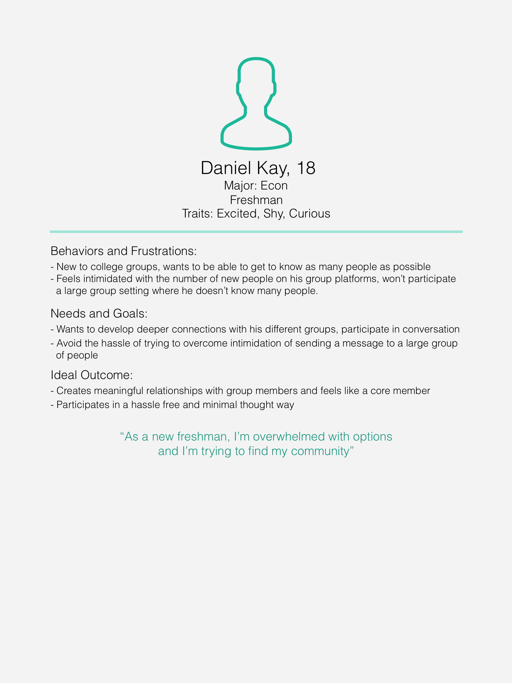
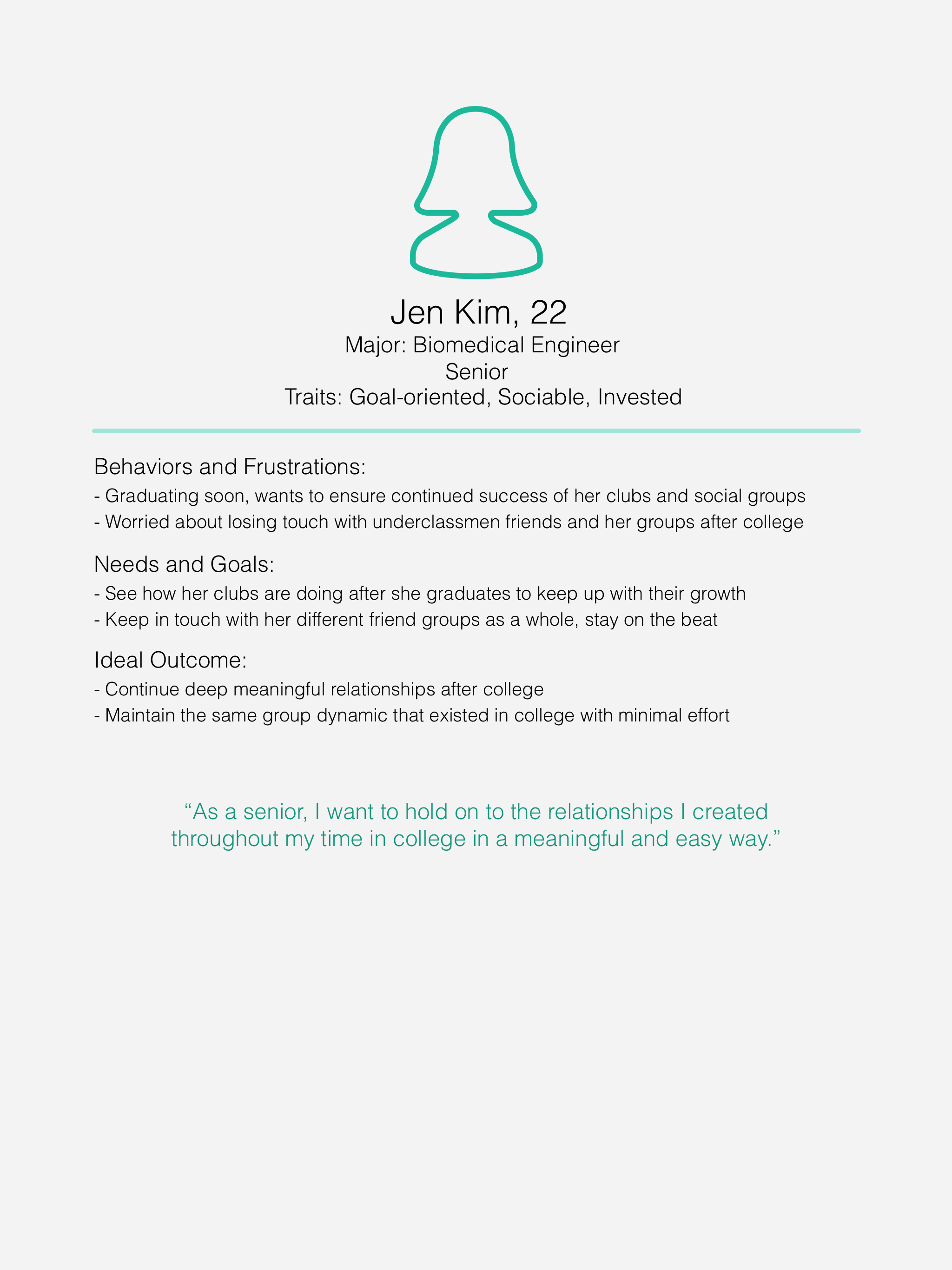
Using these personas, I was able to design the product around real needs. Creating these personas was a good way to map out the key aspects of the product and deliver the needs that each user wants. Our team focused heavily on the inter- and intra-group interactions available, as well as the discover feature.
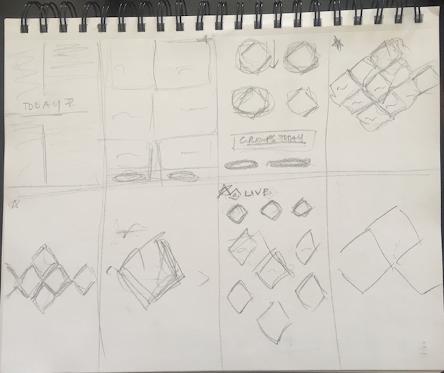
LO-FIDELITY SCREENS & VERSIONS:
Our idea grew from being a way groups could communicate to a platform for sharing, communicating, and interacting. Using the eight-minute technique I learnt, below are the beginning sketches for the main screens of the product.
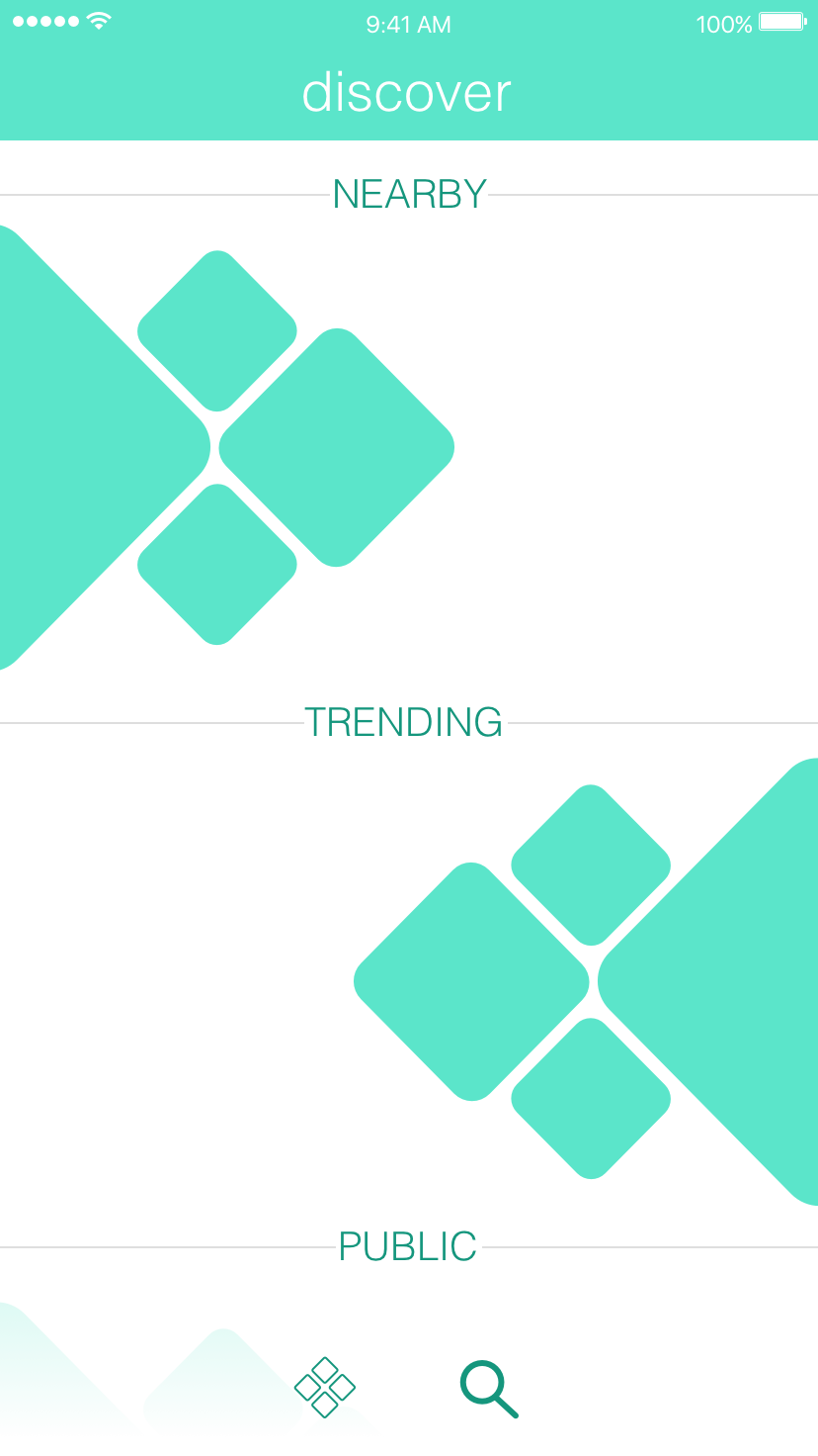
The discover screen posed a challenge because it was important to consider the first three months of the product, ie. designing for whitespace/not a lot of content. I faced some challenges in designing a discover feed that would start off with less content, since it is user generated. Working with my team and discussing technical constraints with the engineers allowed me to dig deeper into a solution before arriving at a conclusion that suited user needs and product goals. Below are some iterations until we got to the final screen stage of a multi-row horizontal swipe discovery page.
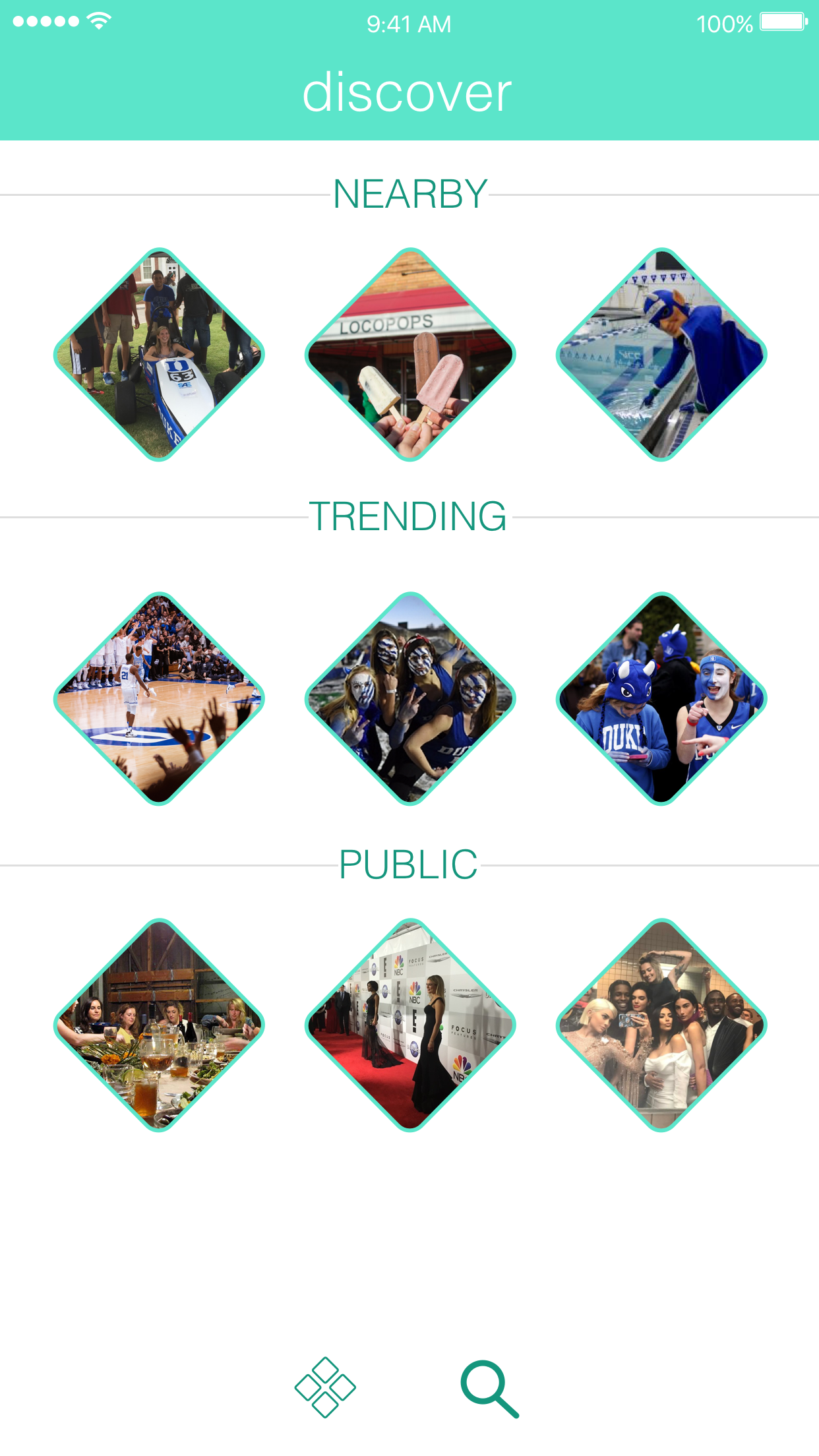
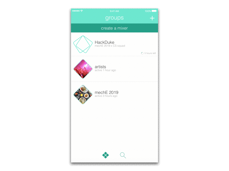
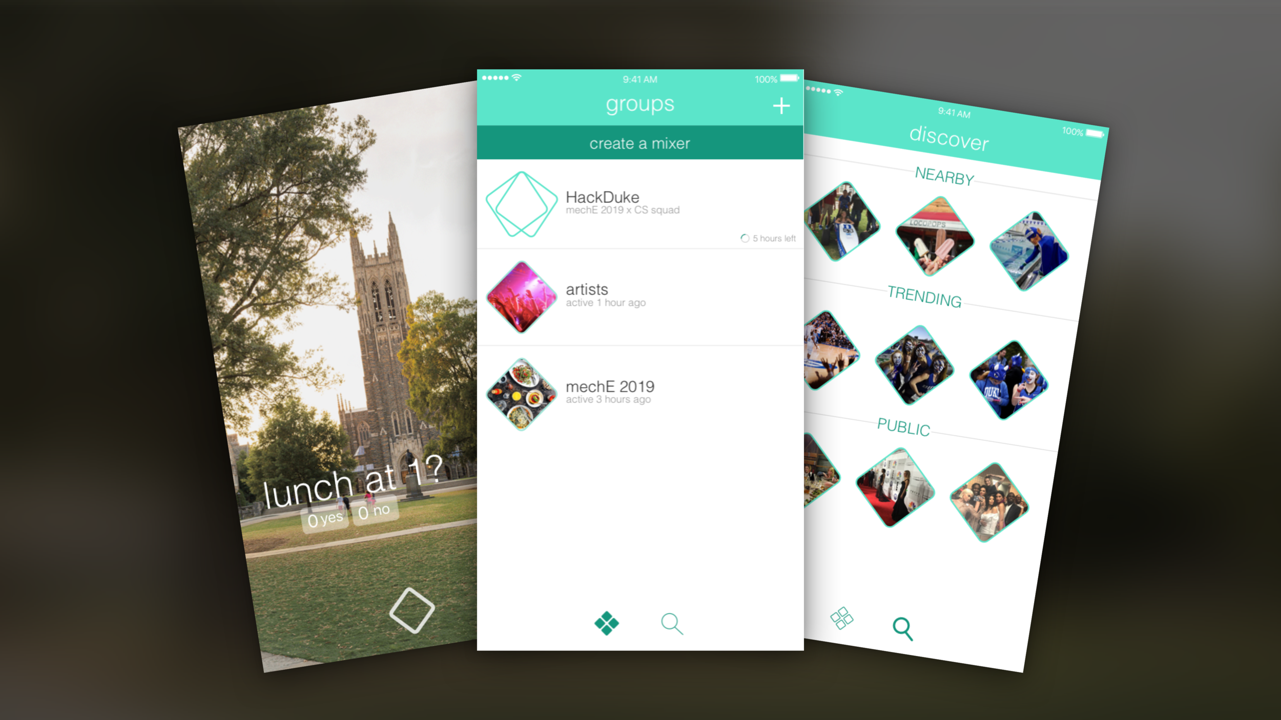
HI-FIDELITY SCREENS:
Our team wanted to put a spin on the way information is presented, something that would distinguish our brand from the rest. After designing the logo, I used components of it to keep the screens and flow constant. The rounded diamond became our key identifier throughout the product, giving us the edge that we were looking for. The prominent features of the product were kept in easily reachable locations (the create a mixer sticky bar, prominently displayed and easily reachable discover icon, and the groups screen as the landing page).
Some fun I had with the interactions:
This product launched to the Duke University student body on April 26th, 2017.