
Overview:
I interned on Uber's Innovation Team this summer and worked on the UberKIOSK initiative - a physical touchpoint that bridges the gap between driver-partners and the Uber product.
I worked primarily on the launch of a queuing system and on redesigning the on-boarding and support flow for the new hardware and software V3 rollout in the Fall.
Innovation @ Uber is a small group that specializes in prototyping and shipping MVP ideas in a 10-12 week lifecycle, testing them in the field, and then integrating the concepts that prove useful into the core Uber infrastructure.
BACKGROUND:
Uber Kiosk was established as a platform to meet the needs of driver-partners and multiple business verticals.
The goal of Uber’s kiosk initiative is to provide a multi-modal human/physical touchpoint for Uber’s ecosystem, to create an intuitive and premium driver signup and support experience in line with Uber’s brand, and to innovate to deliver the lowest cost offering.
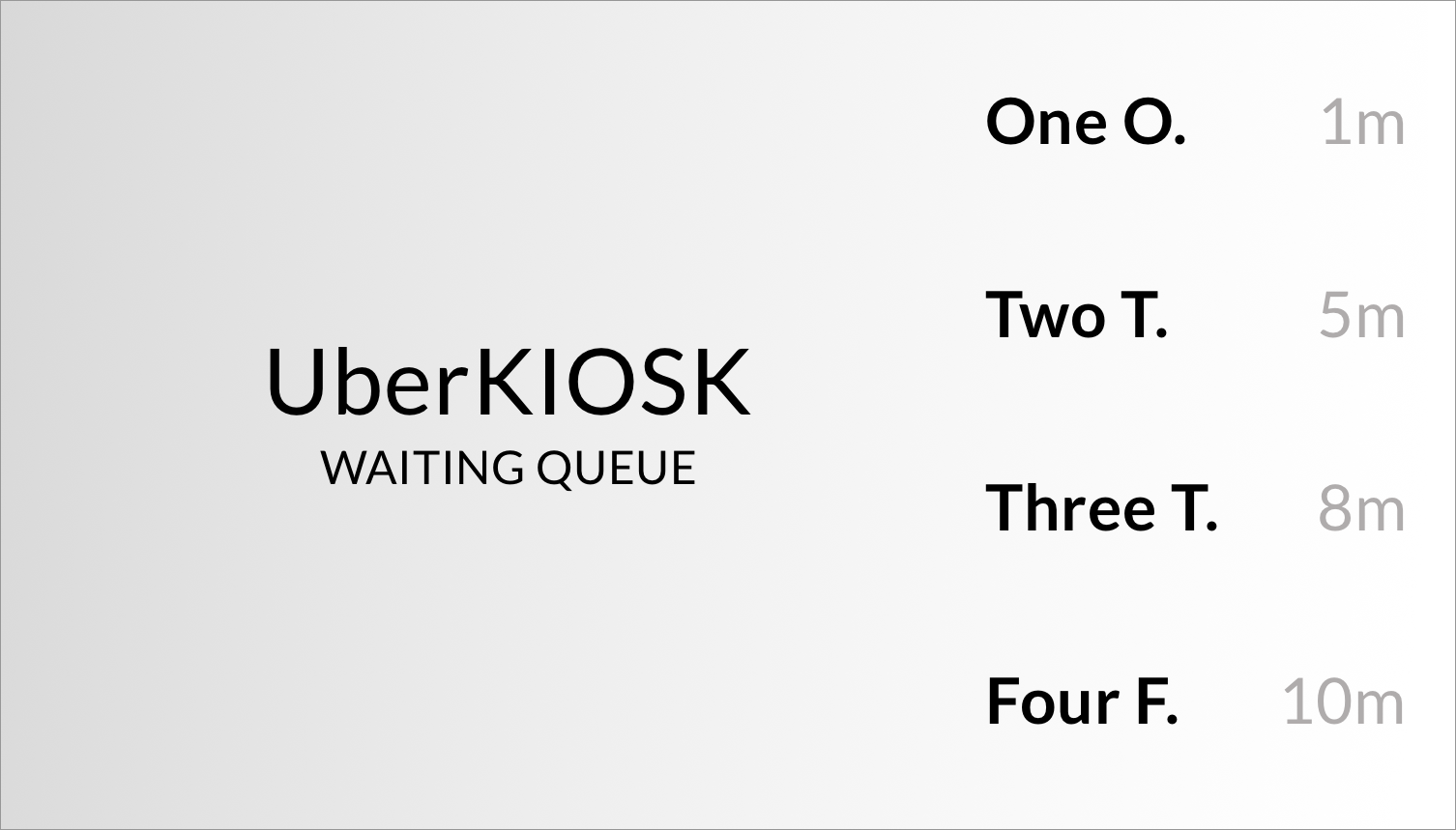
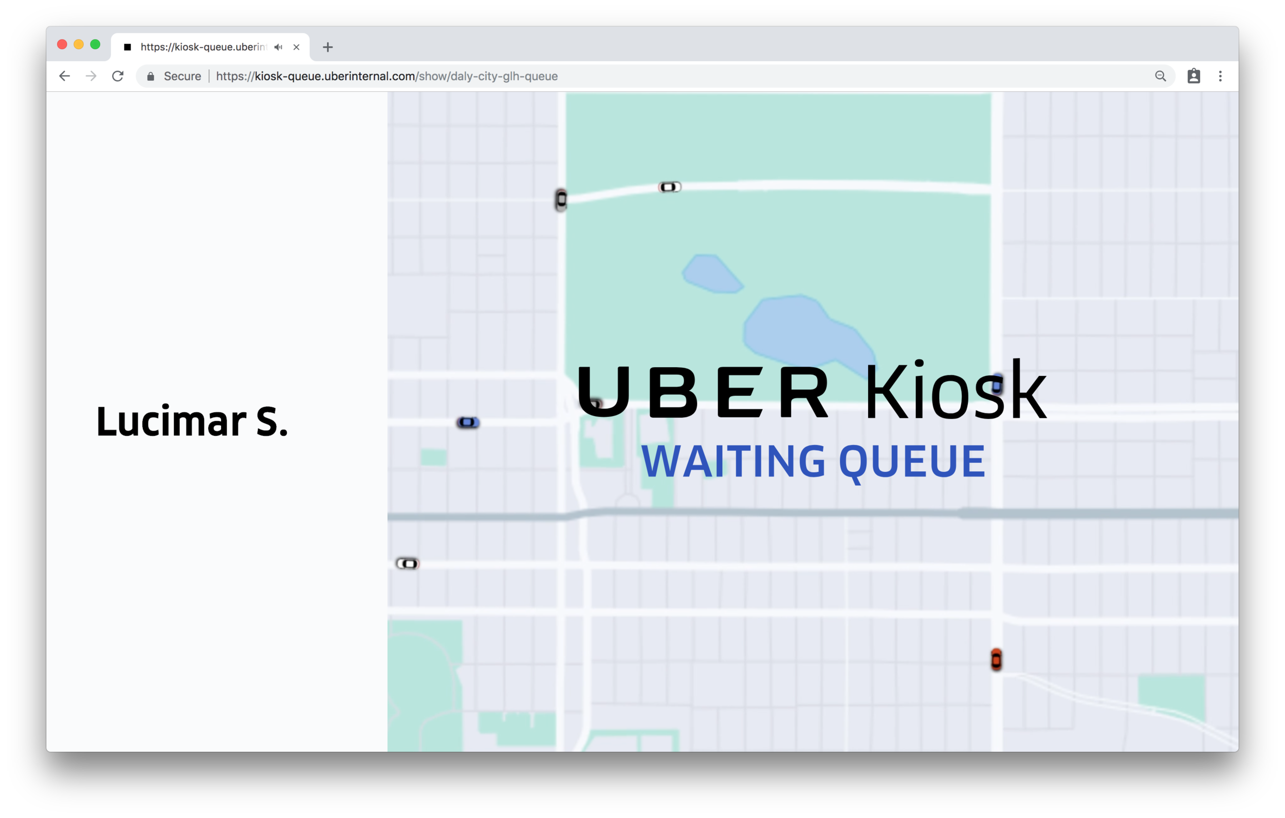
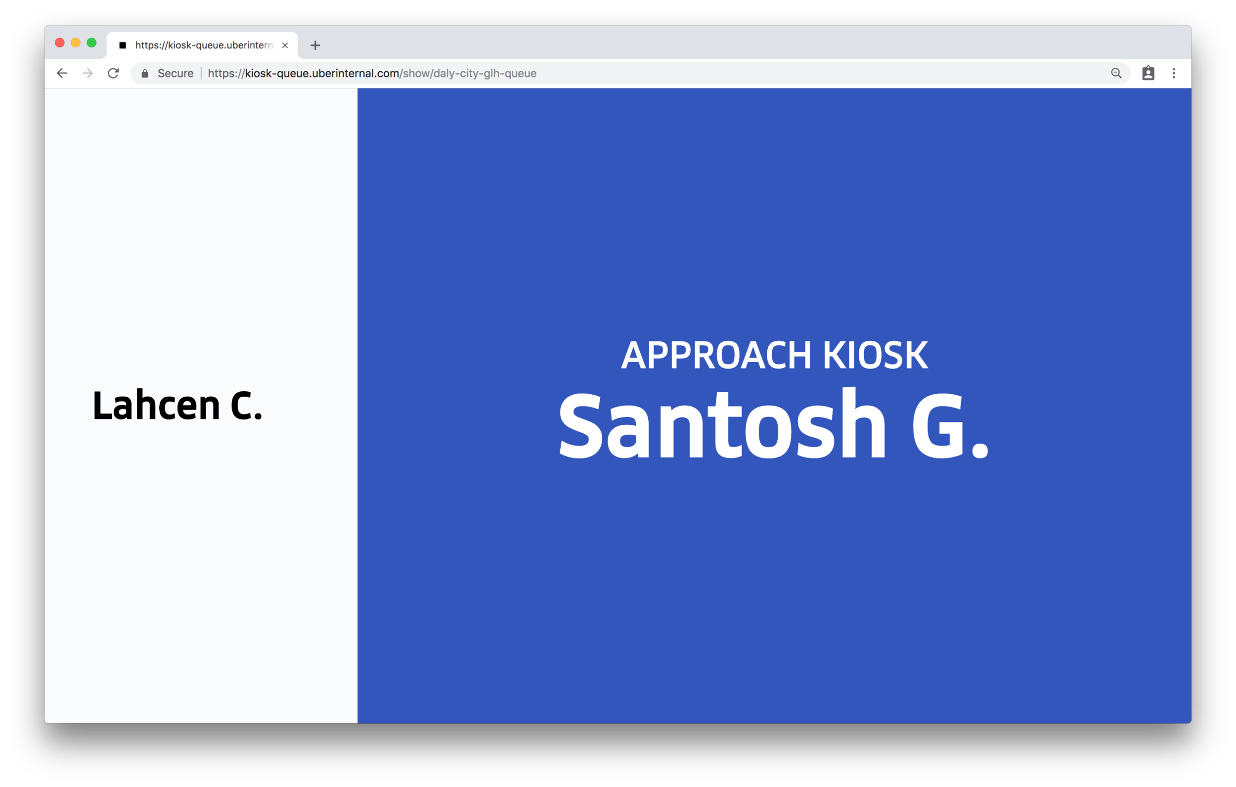
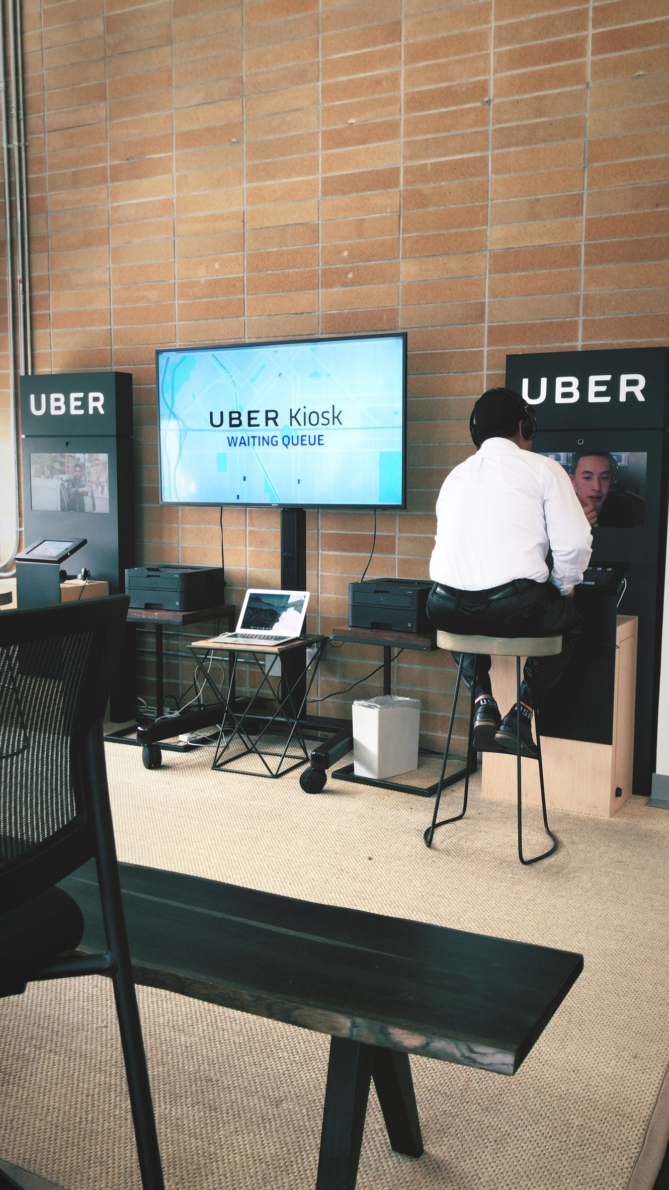
PRODUCT PREVIEW:

RESEARCH:
To conceptualize the queue, understand pain points, and develop a strong understanding of the problem we were solving, research was conducted through an observational study and user research:
Our team observed the interactions of the driver partners at the Greenlight Hub to understand how drivers interacted in the environment
We spoke to the people operations manager and the check-in operator at the Greenlight Hub to develop an understanding of how the support flow and system currently operated.
Outlined below are a few key takeaways from the research conducted:
Drivers would immediately proceed to sit at the kiosk once checked in without understanding that they had to wait.
or…
Drivers would sit at the waiting area without any indication of knowing their step in the process or feedback for when their turn would arrive.
Due to no feedback received after checking in, driver-partners would fail to look up at the kiosk or recognize that they needed to take action when their turn arrived.
There was a fundamental gap in the support ecosystem which the queue could close to create a seamless support experience.
Defining Success:
I distilled the findings from the research that was conducted to define success in two components: the business (Uber), and the user (Driver-Partners). Defining success provided a vision for the end goal of the product and served as an anchor for the design process.
Defining Success for the Business:
1. Automate and increase kiosk interactions per hour by improving efficiency.
2. Allow check-in person to feel comfortable sending drivers to the kiosk.
Defining Success for the User:
3. Drivers have a transparent and cohesive understanding of where they are in the support process.
4. Drivers are provided with a seamless support experience.
With success defined, we began our rapid iteration and testing process.
DESIGN DIRECTION:
The queue was designed in two components: the information components and the animation.
Information Components:
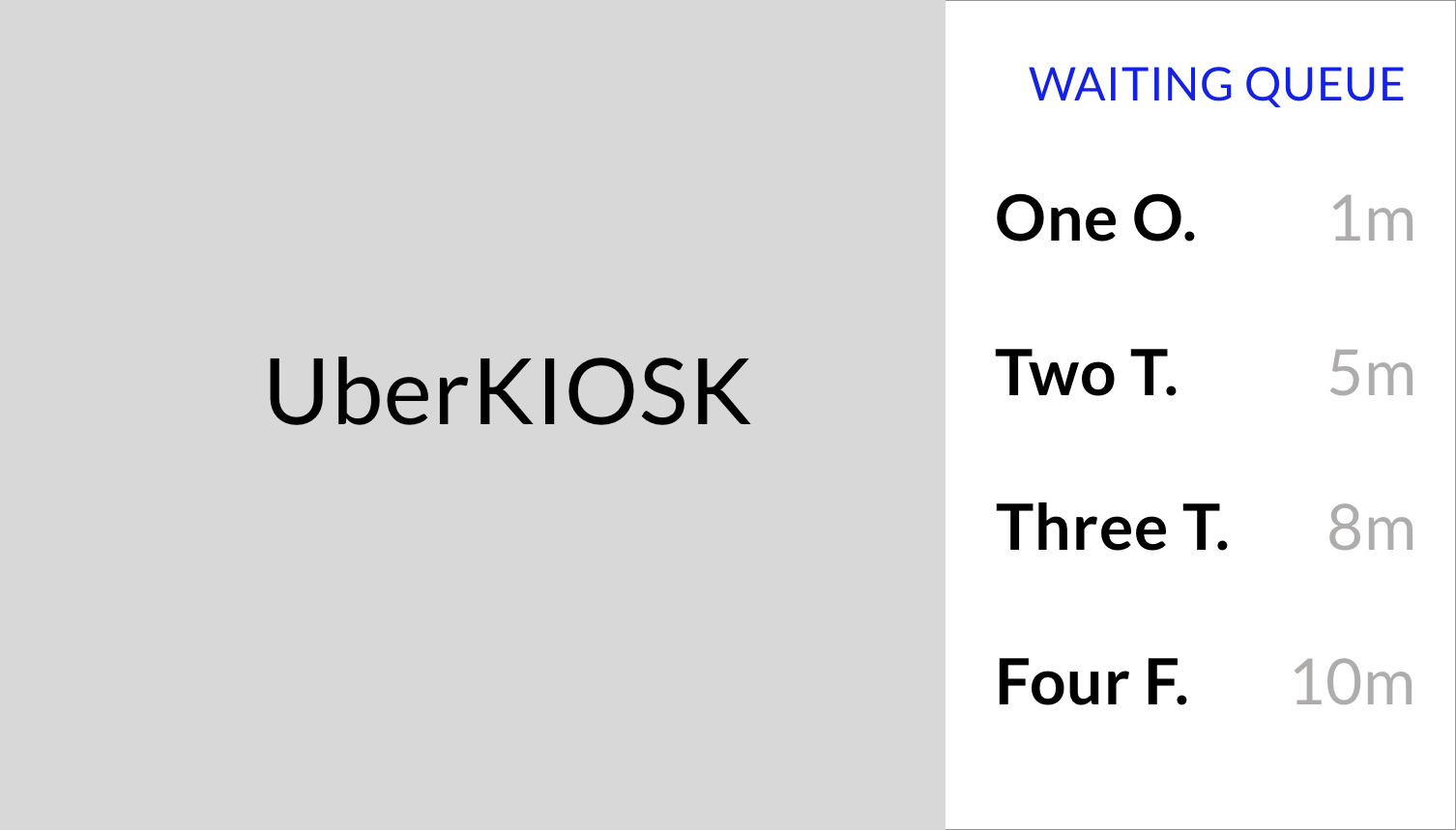
In order to meet the needs of both the business and the user, the queue had to be easy to comprehend for the users and had to provide enough context that there would be minimal time in-between recognition and interaction. Therefore the design had to be simplistic for comprehension, but attention-grabbing for recognition. Below are the two initial designs shipped, which display names clearly and largely in a queue, as well as the calling state that pulses blue when a user’s turn has arrived and action is necessary.
EXPLORATIONS/LO-FIDELITY WIREFRAMES:
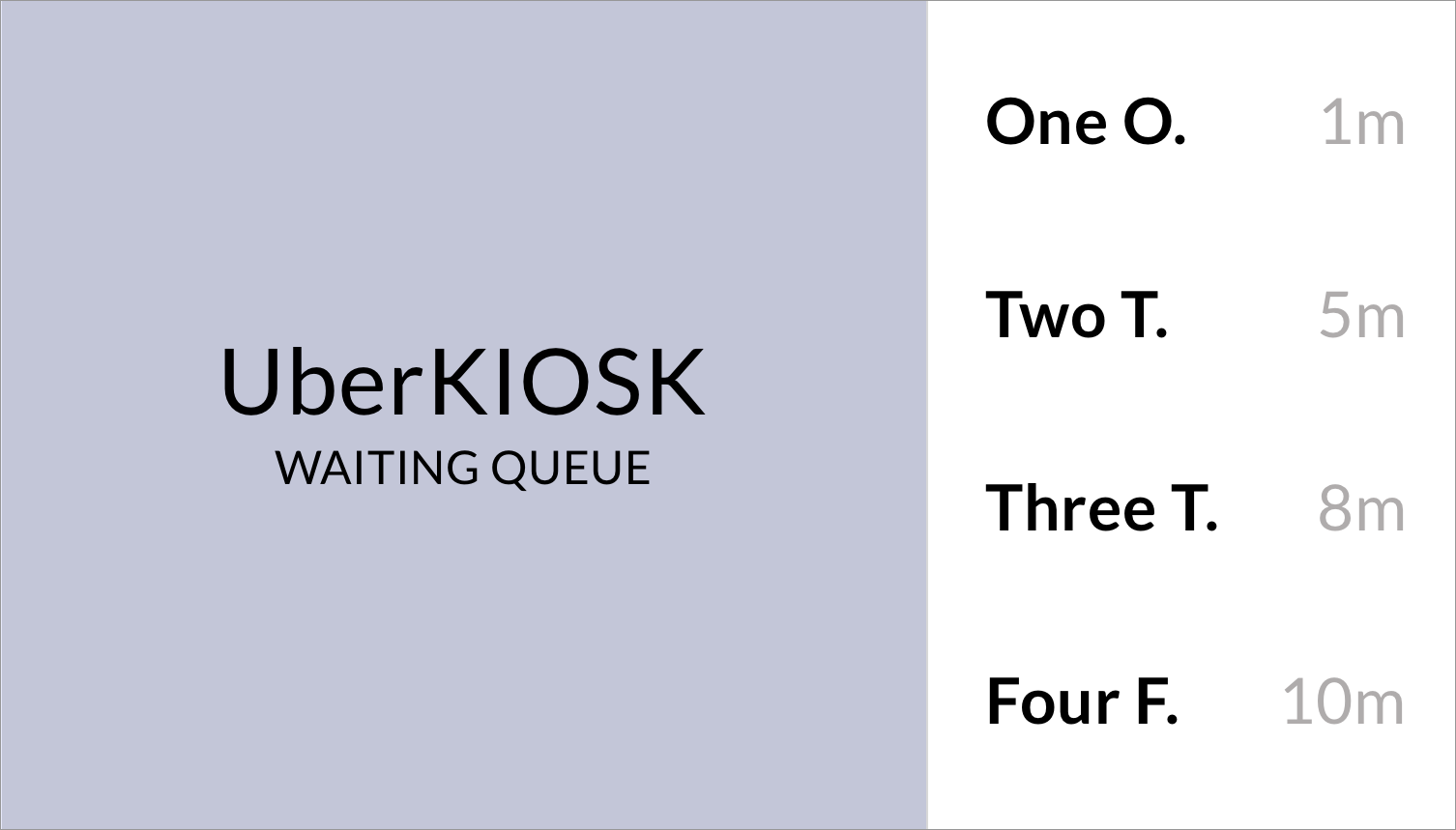
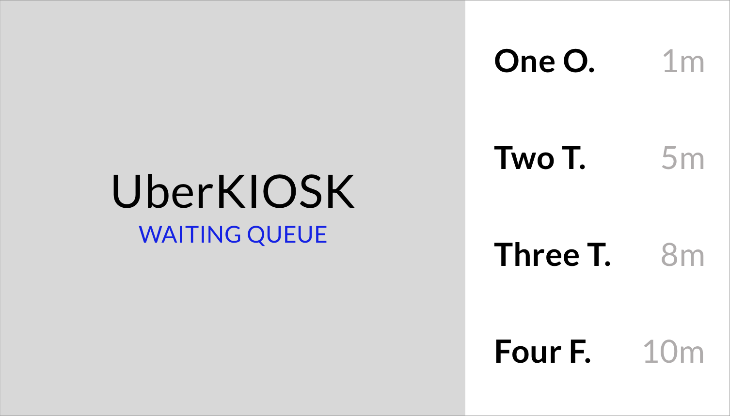
hi-fidelity mocks:
Animation:
In the initial research visit to the Greenlight Hub, the large monitor displayed a repetitive rotating slideshow of Uber’s driver-partners. This created a very stagnant environment, adding to the feeling of incompleteness within the support system.
I was tasked with designing the monitor to enhance the feel & experience of the environment.
The animation was created with the following considerations:
The animation should indicate journey and movement.
Create a dynamic environment.
Dampen the feeling of endless waiting.
Provide cohesiveness with Uber’s existing style.
Testing + Measuring Success:
The initial launch of the queue system was rolled out to a few locations in the vicinity of the Bay Area. After the launch, the team went to one of the test sites on a weekday afternoon and observed the environment interactions for a few hours.
Measuring Success:
Quantitative:
Number of driver-partners being sent to the Kiosk.
Kiosk interactions per hour.
Calls are initiated very soon after name pulses.
Qualitative:
Drivers recognize signs of steps to take, understand signifiers.
Drivers wait their turn before walking up to the Kiosk.
learnings:
The observations post-launch provided some valuable insights into design considerations for the next iteration.
Uber’s driver-partners come from diverse backgrounds, therefore wording needs to be simple to communicate with all users effectively.
Every pixel matters, the unexpected increase in the size of the monitor at the Greenlight Hub led to a deemphasis of crucial elements.
Context is important, the names displayed with a lack of any time indication or numerical indication was confusing for the users.
Even with research, people act differently than what is anticipated. Human variability needs to be accounted for.
further explorations:

We ran multiple design sprints such as the one shown above to create the final working version of the design system.
Because of the novelty of the Kiosk and the rapid pace at which it’s grown, there was not a design system in place for the Kiosk experience. I spearheaded creating a design system by cross-functionally working with the multiple different teams that fell under the Kiosk ecosystem, in order to make sure that the Kiosk was meeting the needs of all the components involved. I wanted to create a system so that the future design team could build upon it.
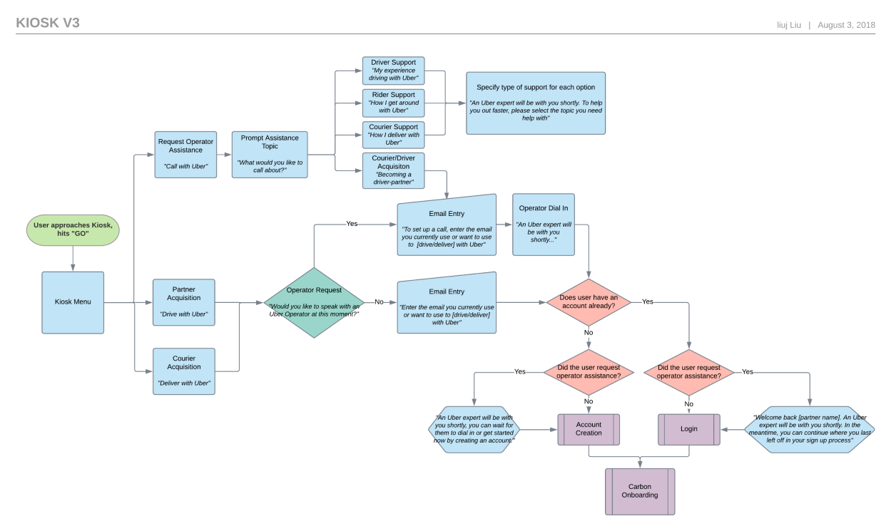
Shown below is the initial user journey I worked on that incorporates all the collected information architecture.
BONUS:
I designed an interaction for the Kiosk that could be used with versatility. It could act as an animation for captivation or a loading screen animation. In this scenario, motion was important to convey excitement, movement, and progress. I used Uber's familiar atoms and bits to communicate the Uber brand.
